Year-end brings a flood of pictorial recaps and remembrances: tributes to public figures who died and a veritable parade of the best-of-the-best images. Each tells a story in a powerful, profound, and personal way.
I was especially struck by The New York Times’ 2014 “Year in Pictures” and likely more so this year than previously because 50 Greatest National Geographic Photographs fills the Woodson Art Museum’s galleries through February 22, 2015.

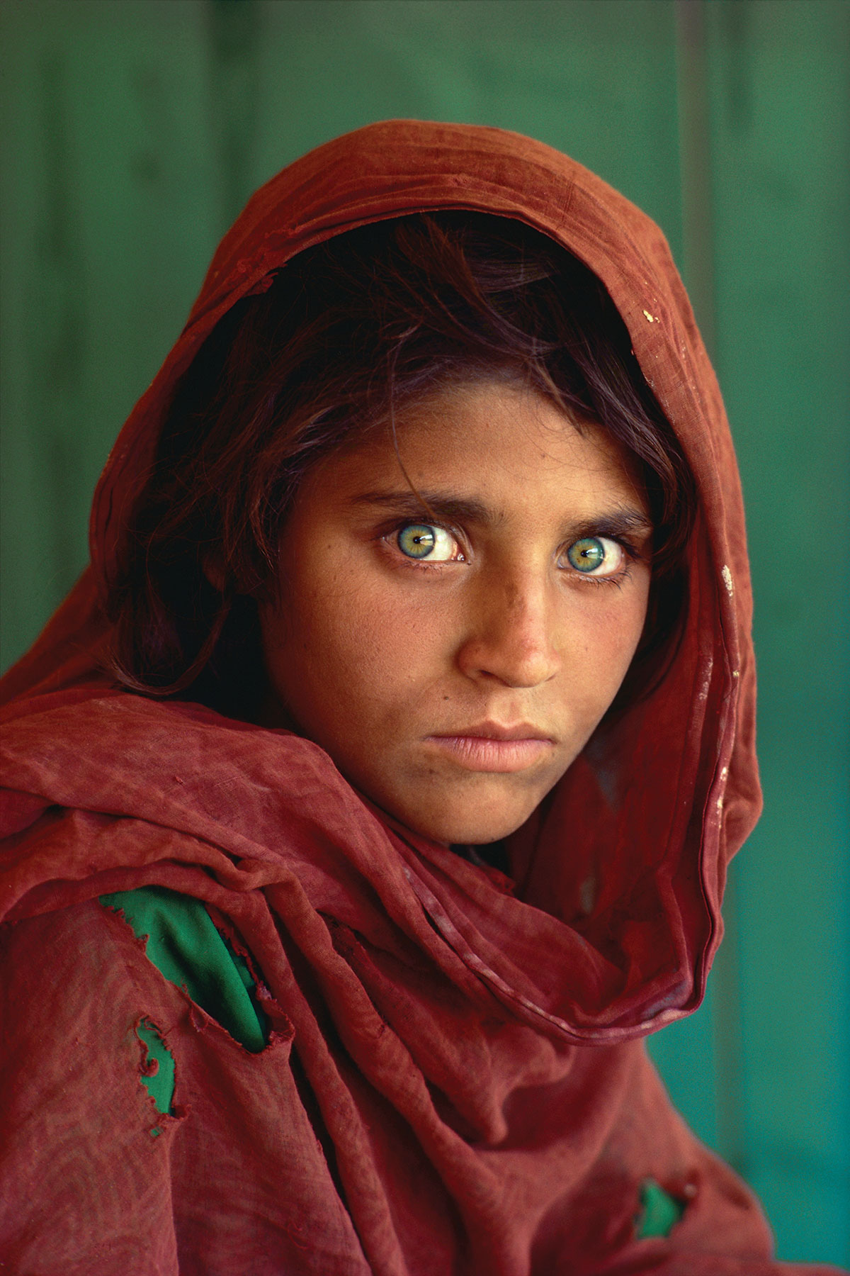
Steve McCurry, Afghan Border, Pakistan, 1984, ©National Geographic. “50 Greatest” is produced and traveled by National Geographic.
How does someone – or a team of people – select just 100 images to tell the stories of an entire year? How did National Geographic editors deem those images comprising the exhibition “the 50 greatest”?
Meaghan Looram, a deputy editor of photography at The Times, who helped select the 100 for 2014 said, “Images that are published in the ‘Year in Pictures’ are singular. They must be powerful enough to stand alone, and in that sense, they must be iconic. . . . each frame must be instantly communicative, and cannot depend on lengthy textural explanation or transitional images to provide context.”
In an accompanying essay, Times writer Dana Jennings posed this question: “How close are you willing to get?”
One clear answer that characterizes the 2014 “Year in Pictures” and the 50 Greatest National Geographic Photographs is as close as necessary . . . and then likely even closer.
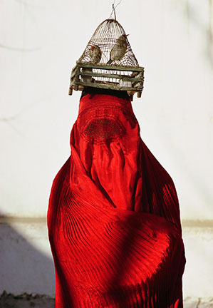
Which images featured in 50 Greatest speak to you? Is it Steve McCurry’s Afghan Border, Pakistan, or Thomas J. Abercrombie’s Afghan Woman, Kabul, or Joanna B. Pinneo’s Sub-Saharan Mali?

Thomas J. Abercrombie, Afghan Woman, Kabul, 1967, ©National Geographic.
“50 Greatest” is produced and traveled by National Geographic

Photo by Joanna B. Pinneo, Sub-Saharan Mali, 1997, ©National Geographic. “50 Greatest” is produced and traveled by National Geographic.
Put the power of pictures to the test. Check out the 50 Greatest exhibition and be moved in ways you might not have thought possible.


