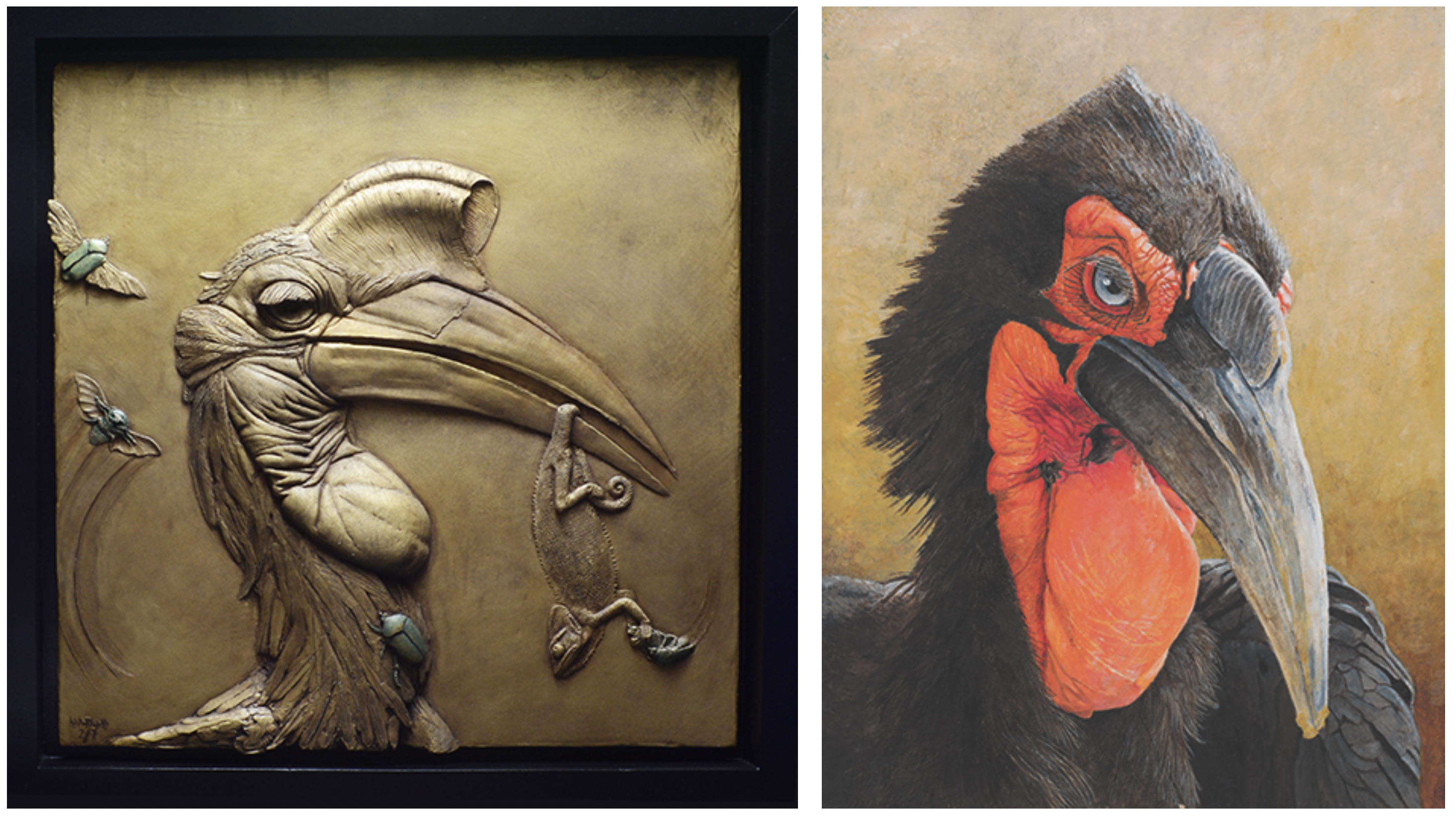
Adam Matano, Starving in the Belly of a Whale, 2018, resin; Haruki Koizumi, Southern Ground Hornbill, 2019, oil on board
Each year, as Birds in Art inevitably sneaks up on me, I consider ways to share and interpret the avian-themed artwork with Museum docents, visiting students, and program participants. The annual process of looking for serendipitous themes or popular subjects in Birds in Art begins in May, when fellow curator of education Lisa Hoffman and I view small, printed images of exhibition artworks spread out on the library table by administrative manager Shari Schroeder. Some years, staff is left wondering if artists exchanged with one another a “this year, we’re doing corvids” memo, while other years might feature an abundance of square formats or unexpected framing devices.
From my perspective, one of the most consistent takeaways or “big ideas” one can easily glean from Birds in Art is how well-suited the exhibition is for exploring the building blocks of visual analysis – the elements of art and the principles of design.
Another engaging and accessible opportunity afforded by Birds in Art is the ease with which one can compare and contrast similar subjects or settings across multiple mediums.
Devising engaging, interactive ways to explore visual elements during each exhibition is a welcome creative challenge and gives me a chance to develop designs for “tour props” (hands-on educational materials) used by Museum educators and volunteer docents when leading group experiences in the galleries.
Several Birds in Art paintings that feature ducks on water are in close proximity to one another in the gallery, providing an excellent opportunity to compare how light and color affect shadows and reflections.
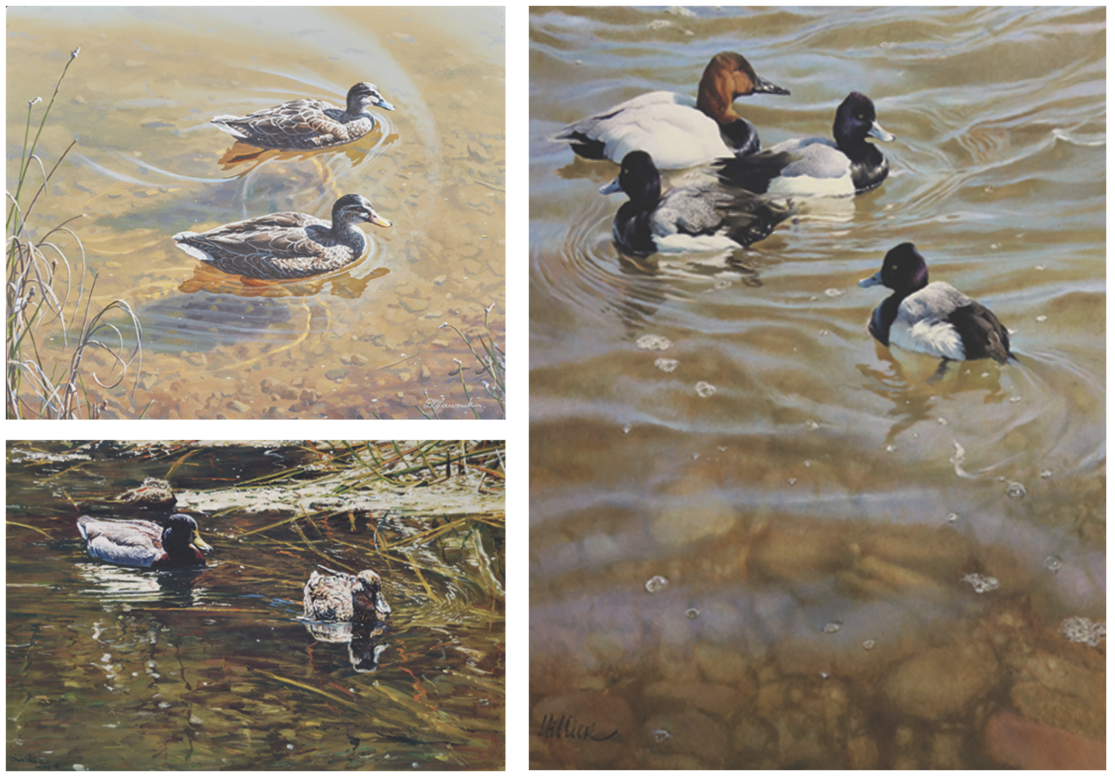
Clockwise from top left: David Lawruk, Pacific Black Ducks, 2019, acrylic on gessoed MDF board; Matthew Hillier, Odd One Out, 2019, oil on Ampersand board; Dino Paravano, Mallards’ Reflections, 2019, oil on canvas
Discussing these changing elements is one thing, but manipulating them yourself is another – time to make a tour prop.
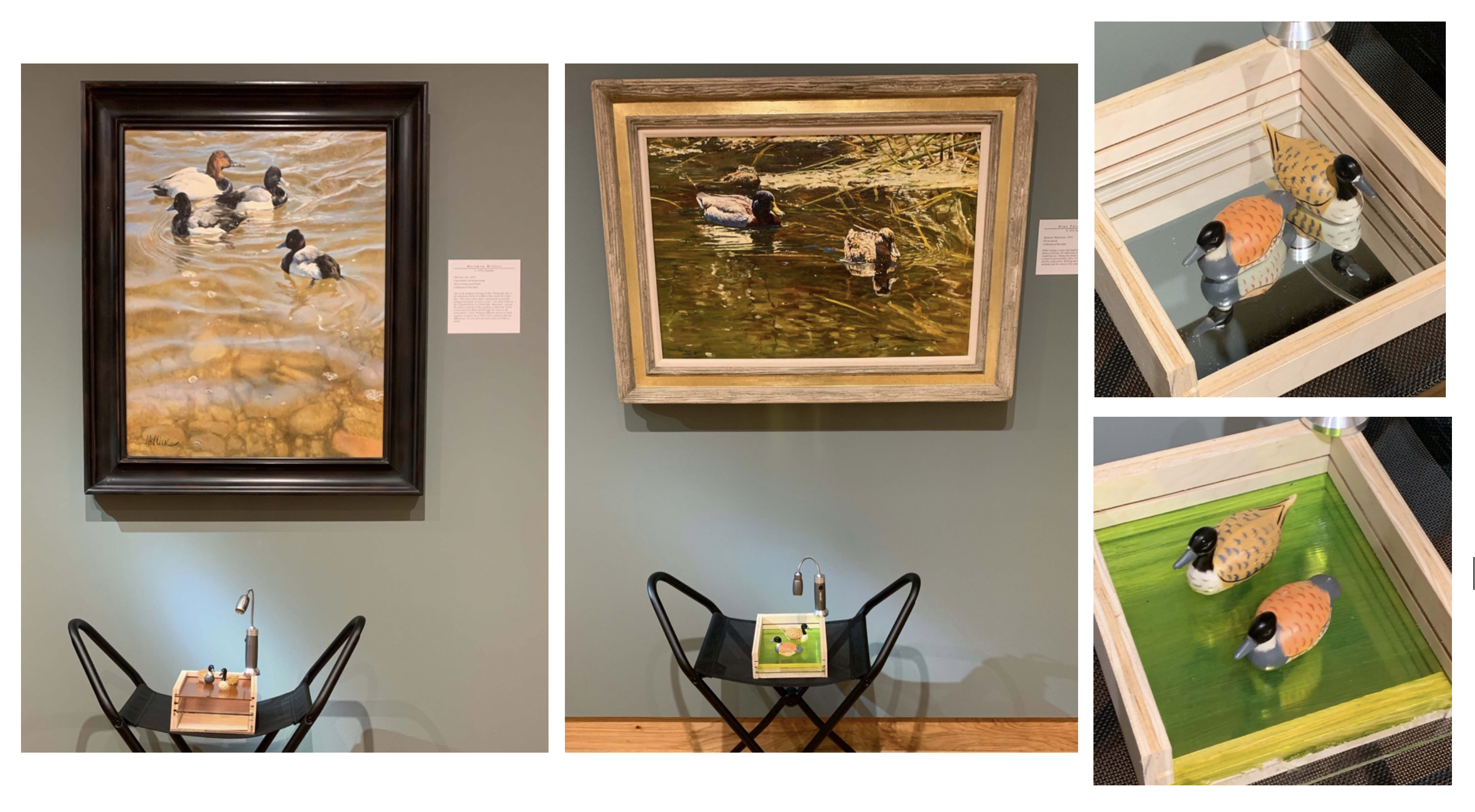
I described my design to facilities manager Dave Jones, who made two three-sided boxes with slotted interiors so plexiglass squares could slide in and out, above the bottom of the box. To one box we added a mirror to its base to represent a clear reflection. I painted a mixture of glue and dye onto the three plexiglass squares – one blue, one orange/yellow, and one green – to represent different colors of water on which the duck models would sit. The colored plexiglass sheets can be combined to layer colors or used alone on either box to show how shadows and reflections on the base of the boxes changed at different heights and when exposed to different angles/intensities of light. Curator of exhibitions Shannon Pueschner mounted two washers to the upper corners of the boxes upon which small, magnetic lights could attach, allowing students to manipulate a light source above and across their models. This tour prop offers an interactive way for students to isolate and experiment with different expressions of color and light and consider the ways in which each can impact the design and mood of an artwork.
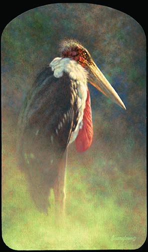
Brian Jarvi, The Undertaker’s Requiem, 2019, oil on Belgian linen
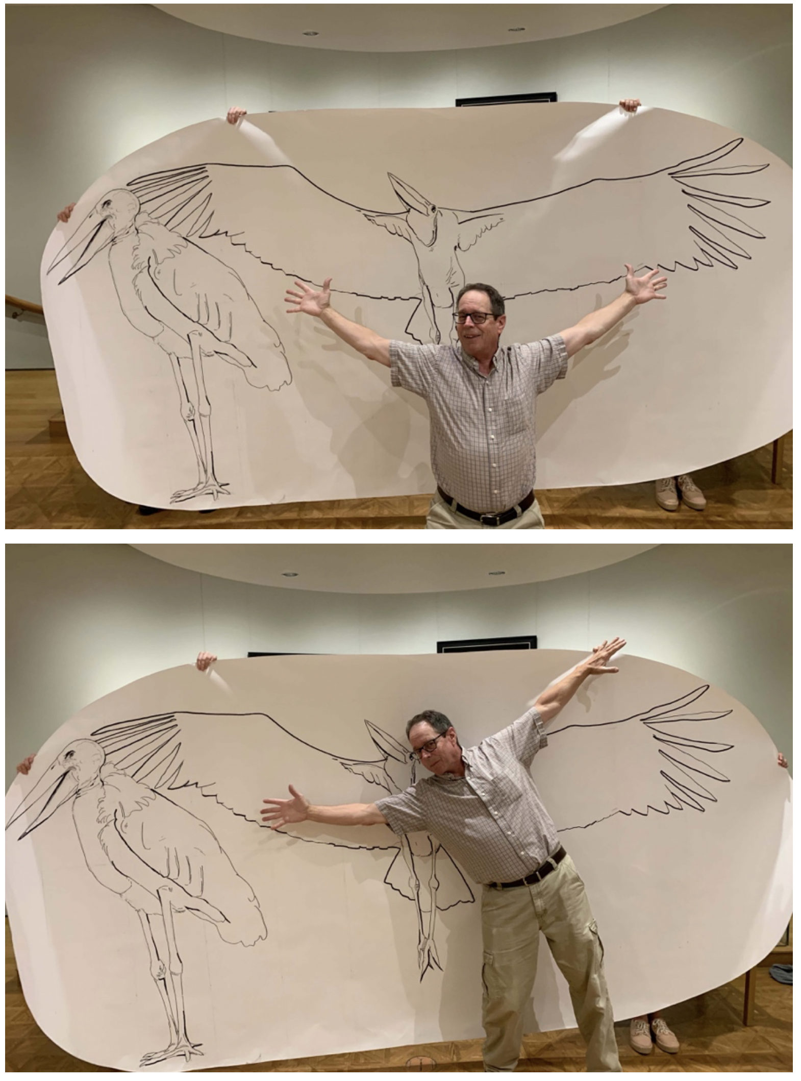 Artists’ aesthetics and approaches to portraying avian life are as diverse as the subjects themselves. Artist Brian Jarvi took inspiration from the marabou stork known as “the undertaker bird,” due to its black, cloak-like feathers and the bird’s featherless head, which when viewed from behind is reminiscent of a man’s bald head, white, wispy hairs, and all. Some might argue that the marabou stork isn’t winning any beauty contests, so why paint such an ugly bird? This presented another opportunity for a tour prop.
To garner some appreciation for the marabou stork’s impressive stats (like its five-foot-tall frame and its wingspan reaching 8-12 feet), we needed to find a way to suggest the true presence of this bird. How better to do so than a scale drawing courtesy of (and modeled by) Dave Jones?
What are some of your Birds in Art “big ideas?” How do you like to think about artwork in the galleries? Wouldn’t your visit to the galleries be more fun with a big drawing of an ugly bird?
